numbers, not adjectives — D. J. C. MacKay
by Carl Edward Rasmussen, 2024-03-12
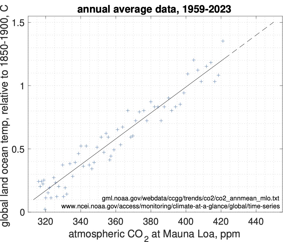
Long-term1 average +1.5°C will likely be reached in 2035 with 450 ppm CO2.
According to the scientifically well understood mechanism of the greenhouse effect, increasing the concentration of greenhouse gases, such as CO2, in the atmosphere causes global warming. Good models of the magnitude of this effect are available, but accurate quantification is challenging, primarily because of feedback effects in the climate system; for example, increasing CO2 causes an increase in the temperature of the troposphere (the part of the atmosphere closest to the ground) which enables it to hold more water vapour, which is also a greenhouse gas, which further increases the temperature and so on. Note that although much of the warming here is mediated by water vapour, it is still caused by increases in CO2.
Instead of complex climate models2, we can assess the recent relationship between temperature and CO2 concentration empirically. Below I plot the average yearly global land ocean temperature anomaly in degrees Celcius (with a baseline of the preindustrial average 1850-1900) as a function of the Mauna Loa yearly average atmospheric concentration of CO2 in parts per million in a scatter plot:
Before discussing this scatter plot any further, I should highlight that correlation does not imply causation. This means that, in the absence of any other information, the correlation observed in the above figure would be consistent with either "increasing CO2 causes warming", or "warming causes increased CO2" or "increased CO2 and warming are both caused by some other factor". However, in the case of climate change, we do have other information, namely an understanding of the causal mechanism of the greenhouse effect.
Here we are using the scatter plot to empirically test the strength of the relationship within the 65 years of CO2 measurements at Mauna Loa. The strength of this relationship is remarkable. The discrepancies between a straight line3 superimposed on the graph to the measurements have a standard deviation of less than 0.1°C. There is no intrinsic reason to think that the relationship should necessarily be very tight. For example, CO2 is just one of several greenhouse gases (methane is another). Other compounds such as aerosols also have an effect on temperature. And we expect the effect of greenhouse gases to take time to manifest itself. Finally, temperature is affected by other processes, such as El Niño and La Liña events. Nevertheless, empirically we find that these effects, over the 65 year time period considered, only manifest themselves weakly or more or less seem to average out, leaving a close to straight line relationship between CO2 concentration and temperature anomaly.
The size of the relationship is the slope of the curve which is very close to 0.1°C per 10 ppm CO2. Extrapolating the graph by a modest amount seems reasonable (dashed part of the line in the plot) in view of the tight relationship over the past 65 years, and we find that +1.5°C will likely be reached when the CO2 concentration is about 450 ppm, or 29 ppm above the current (2023) concentration (421 ppm). Over the past decade, CO2 has increased by 2.5 ppm/year. Therefore, in the absense of radical changes, warming will likely exceed +1.5°C in 12 years, by 2035.